

New Car Logos In 2021
Manufacturers and brands are attempting to embrace the transition to electric vehicles as the auto industry prepares to make the switch. By changing their logos, these companies are signalling the beginning of a new era. Read about the ten car companies that have recently altered their logos. Do let us know which of these new car company logos is your favourite?
Audi
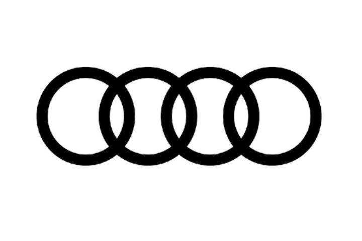
In March 2018, Audi was one of the first companies to adopt the 2D logo design trend. The iconic “four rings” are still there in the emblem, however the silver colour and 3D design have been removed. This latest redesigned logo is referred to be a “digital-first” emblem by Audi.
Volvo
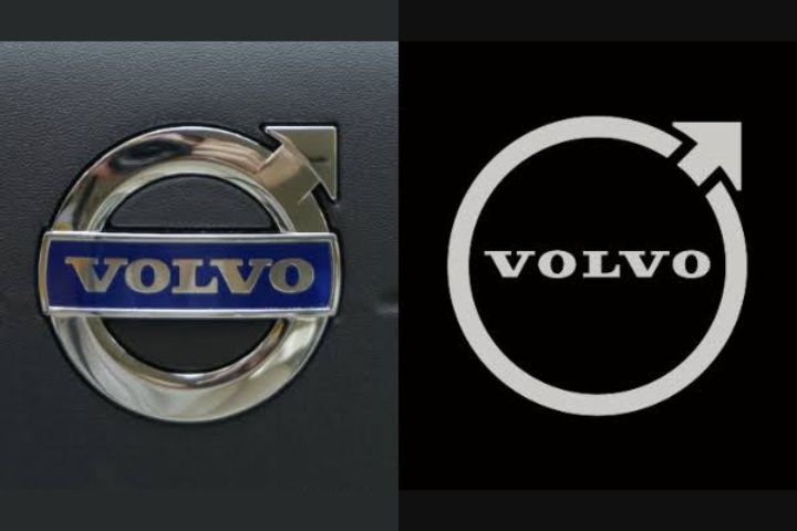
In 2021, Volvo jumped on the 2D logo design bandwagon. It got rid of the “iron mark” insignia that had become synonymous with the company. The new emblem better reflects the automaker’s foray into electric vehicles and the digital realm. The brand will, however, continue to use the existing logo until 2023.
Toyota
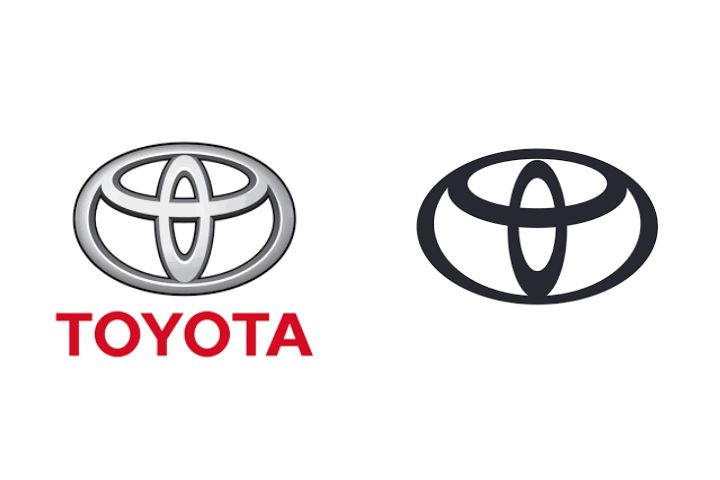
Toyota, like its competitors, ditched the three-dimensional style for its logo. The new 2D design is simple and appealing. The previous Toyota logo style was introduced in 1989. A striking black colour is used in the new logo!
Kia
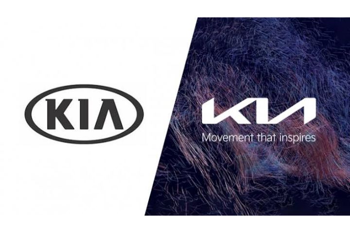
In 2019, KIA unveiled its new logo at the Geneva Motor Show. The re-branded logo aims to position the Korean automaker as a technological leader while also making it appear more aspirational. Symmetry and rhythm are present in the most recent radical design.
BMW
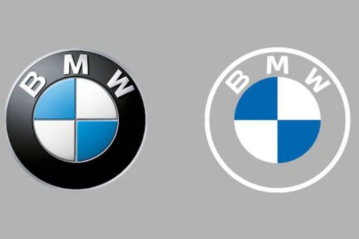
For a long time, you’ve seen the BMW logo in black. And the brand has only made minimal changes over the years. However, the 3D design was recently abandoned in favour of a plain 2D transparent circle on the outside.
Nissan
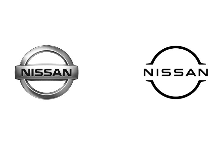
In the year 2020, Nissan unveiled their all-new streamlined 2D logo. This car manufacturer appears to be following the flattened 2D design trend as well. The logo, according to the company, is linked to its long history of invention and heritage. This logo was first seen on the Nissan Ariya electric crossover.
Renault
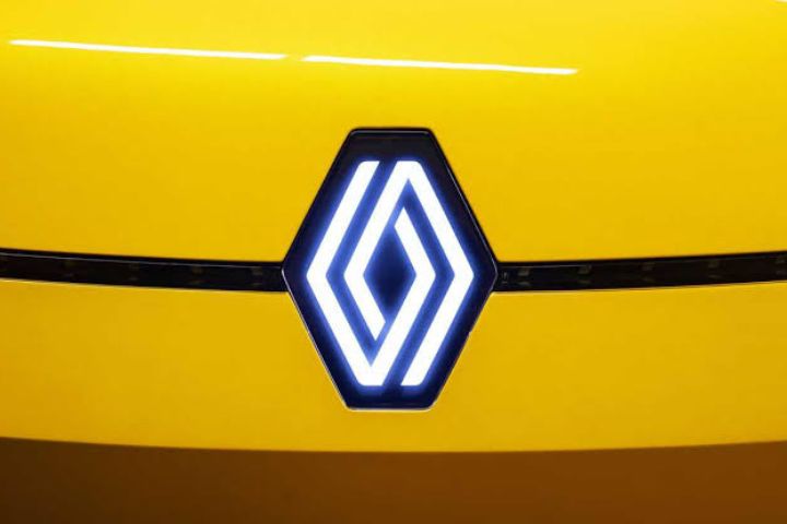
With the debut of the Renault 5 Prototype, Renault opted to unveil its new emblem. The new logo represents the concept of “nouvelle vague,” which translates to “new wave.” The new logo matches the brand’s newest, most modern, and colourful vehicle lineup.
GM

GM just unveiled its new tagline, “Everybody In,” as well as a new, more vibrant logo. The company’s commitment to zero emissions, zero crashes, and zero congestion led to the creation of this new logo. “Clean skies of a zero-emission future” is evoked by the logo.
Mahindra
Mahindra’s “Twin Peak” logo was a substantial change from the company’s previous logo. Mahindra’s attempt to distinguish its SUV lineup in its portfolio has resulted in this adjustment. (Greenroom) The logo was created to express a free sense, according to the designer.
Peugeot
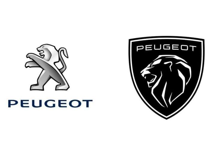
The latest modification to Peugeot’s logo is the automaker’s lion emblem’s 11th iteration. One of the most noticeable modifications in the new logo is the stunning shield-back style. The emblem also has a detailed lion’s head in bright black.
- Also Read :
- Explained : 3 Cylinder Vs 4 Cylinder Engine | Difference, Pros…
- First Diesel Engine : Unfolding it’s History
- Top 10 Most Powerful Production Cars of The Last Decade
Join Us: Facebook | Whatsapp | Instagram


